Media Coursework AS
VOLUME MUSIC MAGAZINE

CONTENTS PAGE
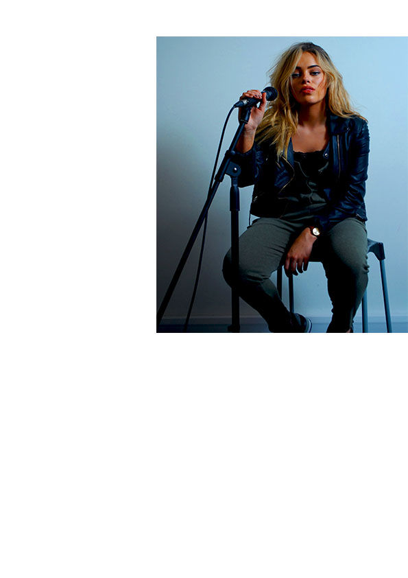
Here is the construction of my Contents page. It shows how I started off with just my photos and how I organised my text around the photos and how the layout of the page formed from the first picture to the last piece of text. I believe my contents page follows the general style and layout of a professional contents page like 'NME' and 'Q' magazine, however this contents page is unique to my magazine because of the house colours used and the information used within the contents page. I have placed the photos roughly in the same places which magazines like 'NME' and 'Q' place their images to really show off the images. I have organised the text around the images in a format which is organised and easy to read and understand for the audience. The titles of the page are much bigger and easily visible for the audience to understand and read. I have kept to the overall house style and colour of red, white, black and grey which I believe are sophisticated colours and really emphasise the magazines professionality. I have included social networking sites at the bottom of the page to again show the audience that it is a professional magazine with lots of professional features in it like these social networking sites. The text is written in the font 'Rockwell' and varies in size depending on the importance of the text, for example, the 'IZZY'S RETURN' is in a much larger font size as this is a more important story than the others for example the 'WHERE THEY ARE NOW' headline. I have structured the columns of text in a professional way as they are all the same width across and not one text stands out more than the rest which is what I wanted as the reader’s attention is not altered from the photos to the text. Also the text I used was written in the same font, 'Rockwell', and written in the same colour of black which follows my house style and colour that I have used throughout the rest of my magazine. However I have written the page numbers in the colour red which stands out off the page as I believe this looks more professional as it does not confuse the reader as they clearly see what page each story is on. This same style is used on the 'NME' contents page which is where I got my inspiration from. I have included a website at the top of the page underneath the page number and date which I believe made the magazine contents page look more professional and realistic. Also main banner across the top of the page is in a grey strip which follows the overall colour scheme I have used throughout my magazine. The title read 'CONTENTS' which is easily visible, as it is in a much larger text than the rest of the page, and this will be the first thing on the page that the audience reads.


